bConnected App Redesign
Project Roles: User Experience, Information Architecture, Hi-Fidelity Mockups
Team members: Aaram Kamali, Billy Barry, Chase Thiebaut, Sydney Noland
bConnected App Redesign
Project Roles: User Experience, Information Architecture, Hi-Fidelity Mockups
Team members: Aaram Kamali, Billy Barry, Chase Thiebaut, Sydney Noland
How can we make the bConnected app more useful for students and give it an updated look and feel?
Application Redesign
The Ball State University bConnected team from the Information Technology department came to us at the Digital Corps for a redesign of their aging bConnected application. The mobile application was originally launched on Android and iOS in 2011. The project was hadned to my team in early 2017. At this time, the original design started to visually look dated. As a user experience team member, I also wanted to see if there were improvements that could be made in addition to the visual redesign. Finally we were told that we would not be allowed to add any additional functionality to the application that would require a new data source and we were encouraged to design to fit the application to current platform standards.
Final Design Preview
Interviews and Research
Due to the confidential nature of the bConnected redesign at the time, we were limited to performing primary research on users that also worked at the Digital Corps office with us. We were also given access to an existing Google Analytics dashboard.
We noticed dramatic spikes in usage of the application at the beginning of each academic semester. We also noticed that visits that occured after the first few weeks of the semester had much shorter session durations. This was supported by the conversations we had with fellow students who said they mainly used the application to check their schedules and classmates in the beginning of the semester.
We also noticed that a majority of users (over 70%) selected course schedule from the main page. We saw that the second most used feature was the testing labs page by a large margin. In the original design (as seen on the right), Testing Labs is 5 tabs down. This is below connections, grades, gpa, and about me which were all identified as pages that were visited by an insignificant amount of users regularly.
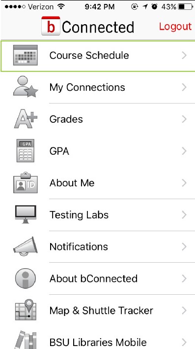
Original Home Screen
Home Page Restructuring
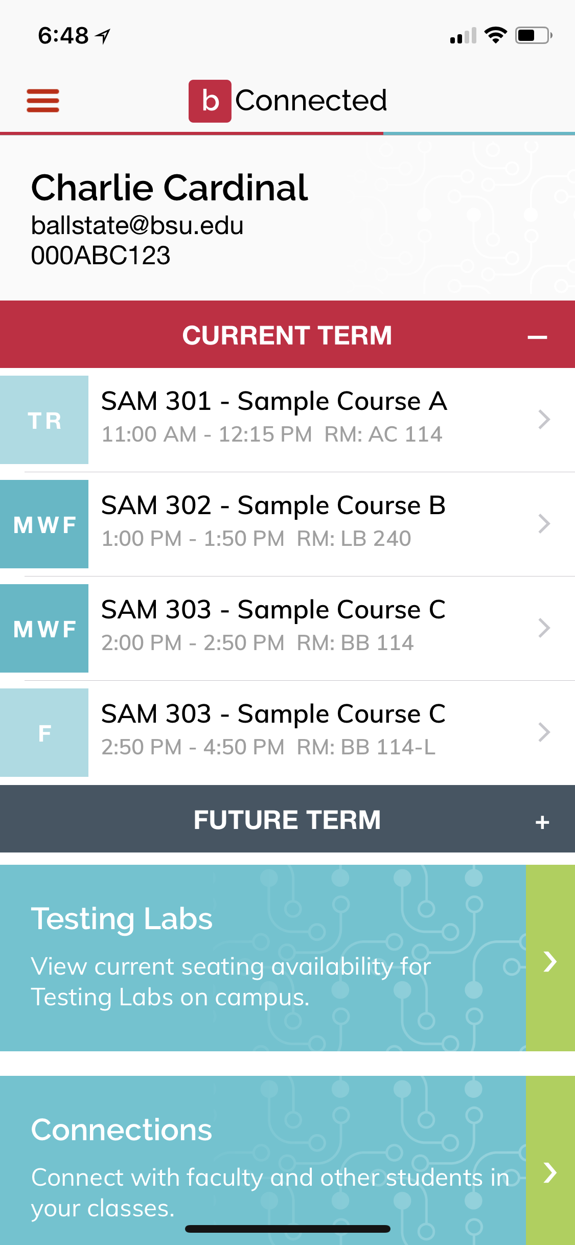
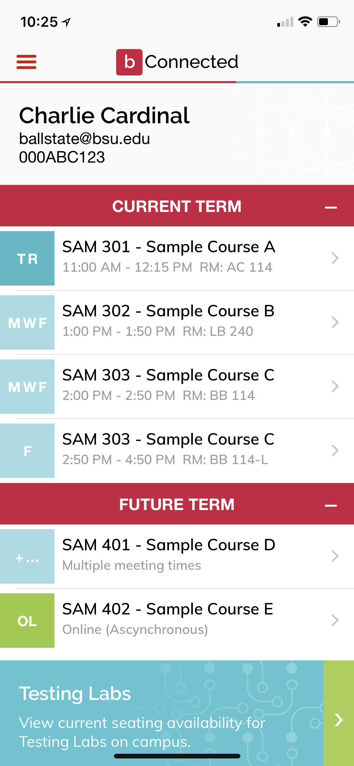
In the original version of the application, to get to a desired course and its information, a user had to select Course Schedule, the term of the desired courses, and then finally the course name itself. In our redesign, we brought this down to one click from the course name from the homescreen. This was done by moving and grouping together items that were used less on the application to "below the fold" or to a place on the application tht requires scrolling down.
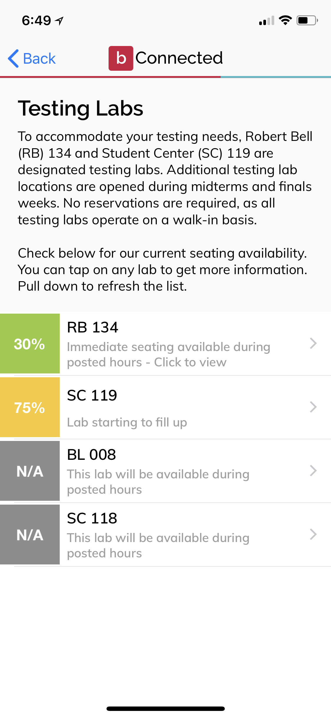
We also moved the Student ID number to the top of the screen. This is based on feedback from interviews that stated that they often used the application to help remember their ID. We also highlighted the Testing Labs section as it was the second most used feature on the application.
Other Changes
We also made several other user centric changes to the application. One of these was making it easier to find classmates that a user had more than one class with by putting a number next to their name in the application. We also color coded Testing Lab availability to make it easier to tell at a glance which labs had available seats for taking exams.
Finally, we made annotated mockups for the development team as well as a high-fidelity interactive prototype using UXPin.
The application update was developed with minimal changes from our design reccomendations and released in it's updated form on the Play Store and the Apple App Store in June of 2017.
Lessons Learned
While we were limited in the number of people we were permitted to speak to, it was great to work on a project with a relatively fast turnaround time that would affect the users we were able to interact with. This was also a good opportunity for me to practice interpreting Google Analytics as well as reorganization of a system to be more user friendly and useful.
Selected Works
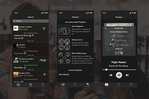
JamSquadInteraction Design Individual Project
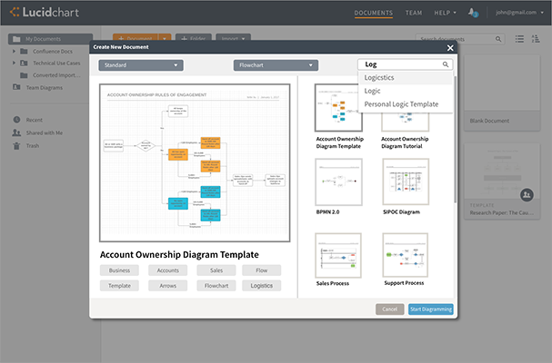
LucidChart Template PickerCompany Sponsored UX Design Project
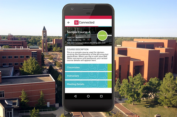
bConnected Mobile App RedesignMobile Application Redesign for Ball State IT
Copyright © Chase Thiebaut
Copyright © Chase Thiebaut
Copyright © Chase Thiebaut